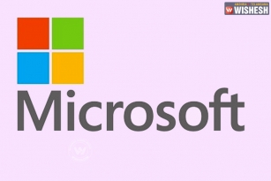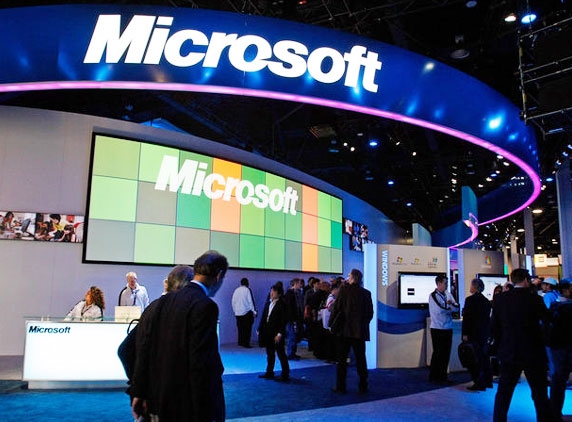
Software giant, Microsoft is all set to change its logo after a long gap. The new logo would have a multi coloured box next to a plan name without italics. Although Microsoft made font changes to its logo in the past, this apparently happens to be the first time wherein a complete logo was changed after a gap of 25 years. In 1987, the blibbet Microsoft logo was changed to 'Pac-Man' logo (italics), which was designed by Scott Baker. Since then Microsoft didn't change the Pac-Man logo although in 2006 the font size was increased and later restored in 2011. Slogans, however, changed from time to time.
The new logo was unveiled on Thursday at a store opening in Boston. The existing logo for windows was modified and attached to the present logo. It has to be mentioned here that Microsoft is gearing up for releasing its new advanced operating system Windows 8 and company officials said the new logo would boost the image of the new windows besides the company too. So, just like how Apple Inc has its logo behind its every product, Microsoft too would presumably print multi coloured square on its products.
(AW Phani)


